Team: Lauren, Kat, Tamlin, and me
My Role: Lead Designer and Lead Researcher
Timeline: 3 week sprint
At A Glance
The Book Room App was designed to elevate the experience of online book clubs. This project was assigned to my group and I to finish in three weeks. I was one of the UX designers and UX researchers. Through user research, my team and I discovered that Amazon products that currently exist in the market aren't organized and don't have dynamic engagement modules. My team aimed to solve this problem through structuring the experience and making it more user driven.
Lost in the Pages: Discovering What Online Book Clubs are Missing
COMPETITIVE & COMPARATIVE ANALYSIS
To see how other companies compare to Kindle, we conducted competitive and comparative analysis of the competitors. Kindle does a good job in progress tracking & in-book highlighting and notes, but its competitors address key user needs that Goodreads doesn’t have. We used it as a baseline to compare with the competitors. They are Goodreads, Fable, and Storygraph. I’m a current user of Fable so I brought it up to the team as a direct competitor. The insights we got from doing the analysis allowed us to see what the platforms’ strengths and weaknesses were.
Most competitors offer analytics, ratings, and a variety of contents. Some include book tracking, social engagement features, personalized content, and user friendly navigation. User friendly navigation includes things like labels being descriptive, features are grouped together that match users’ mental model, and frequent actions are prioritized. Features like community board and gamification were rare. Knowing this helps us in determining what features everyone in an online book club needs.
USER INTERVIEWS → AFFINITY MAP
I created the initial interview questions. I based the questions around the reader’s reading habits & around whether they were in a book club or not and why or why not. After doing a design studio with my team about the interview questions, I ended up making 5/15 questions.
I interviewed all 7 interviewees that were either in book clubs or weren’t in book clubs, and integrated our findings into an affinity map. If you want to see the whole affinity map, click here. There were 4 distinct themes that arose from the user interviews:
Reading fuels connection
Social motivation
Desire for online interaction
Discovery & organization challenges
Goodreads
✅ Strengths
comprehensive book discovery & organization
engaged reader community
❌ Weaknesses
outdated UX & performance issues
weak personalization & overload
💡Key Takeaway
Opportunity to create a more modern, intuitive platform.
Fable
✅ Strengths
curated book clubs & expert led discussions
modern, intuitive interface
❌ Weaknesses
no gamifications
lack of personalization
💡Key Takeaway
Opportunity to enhance engagement by adding personalization features and gamification.
Storygraph
✅ Strengths
personalized & insightful reading experience
reader centric features & design
❌ Weaknesses
limited community & social engagement
platform growth challenges
💡Key Takeaway
Boost community, expand content, and improve mobile for a richer reader experience.


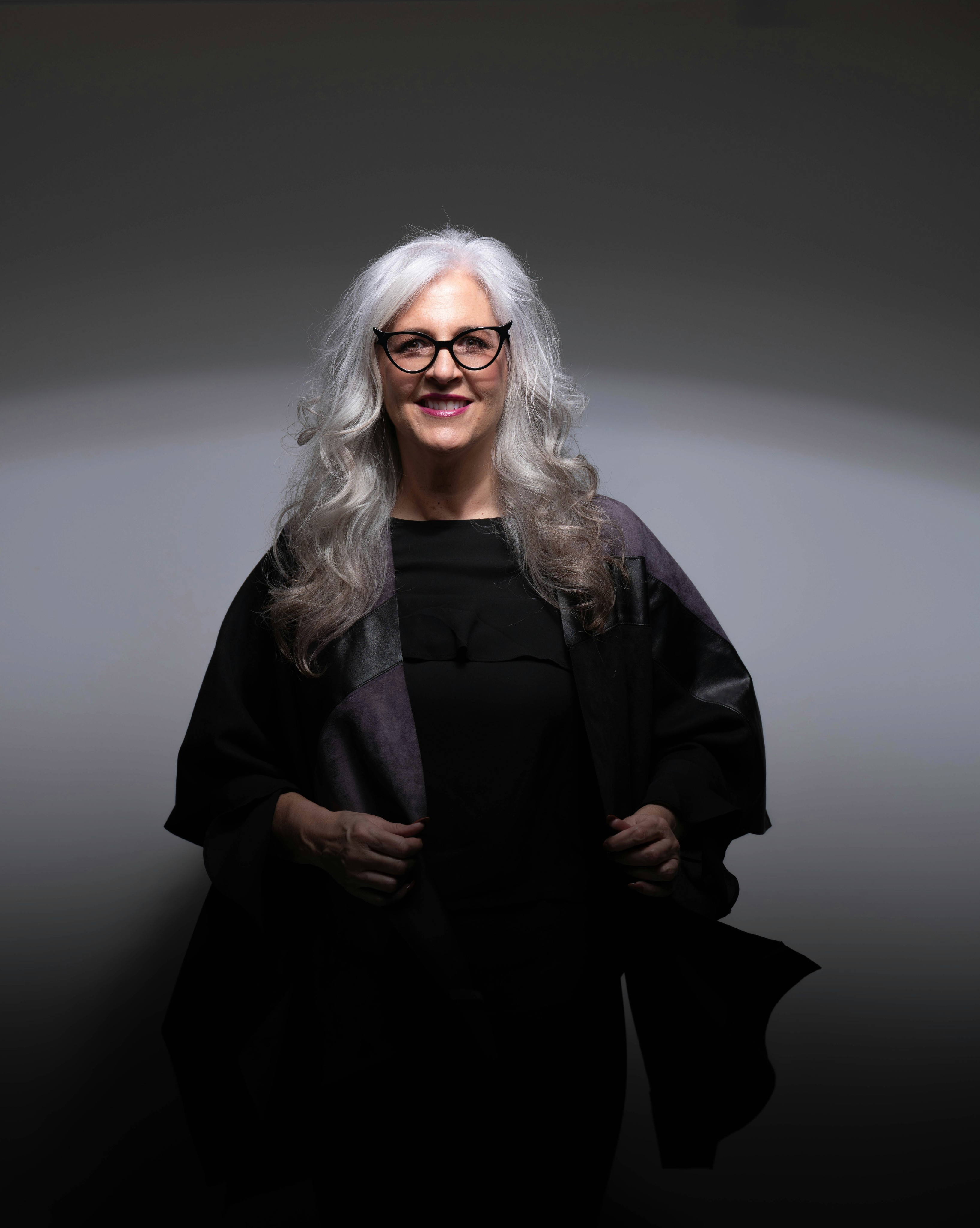
Meet Ava
In the beginning, the issue seemed simple, which was to create a better online book club experience. But as the team dug deeper, “better” meant different things for different users of the online book club. Through the research, we were able to understand what frustrates our users as well as what are the goals of our users. Creating the user persona gave clarity in who we were designing for. From there the problem became clear, “Ava, an experienced book club hostess, is looking for a way to manage her current book club and start new ones in her community. She is disappointed in the current apps she has tried because they lack organized discussion."
Ava R
The experienced book club hostess
Age/Identifying Gender
64/Female
Location
Miami, FL
Occupation
Retired Lawyer
Family Status
Married/Empty Nester
“Reading is a way to keep life filled with joy, and I love sharing that joy with others.”
Bio
Ava recently retired with her husband to Miami FL and is looking to continue her passion for book clubs alive. She loves being a hostess, and during her career she found that book clubs were a great way to escape the stress of her career. She is excited to start a new book club in a new area, but needs help finding people to engage with, and a way to maintain her existing book club back in Chicago.
Goals
Create a new local book club
Find a way to maintain her Chicago book club long distance
Have ways for book clubs to vote on next months books, and track upcoming discussion events
Pains
Having to spend too much time doing research on book club apps
Being disappointed by most of the apps she tries
Finds people will stop being involved if organization isn’t clear.
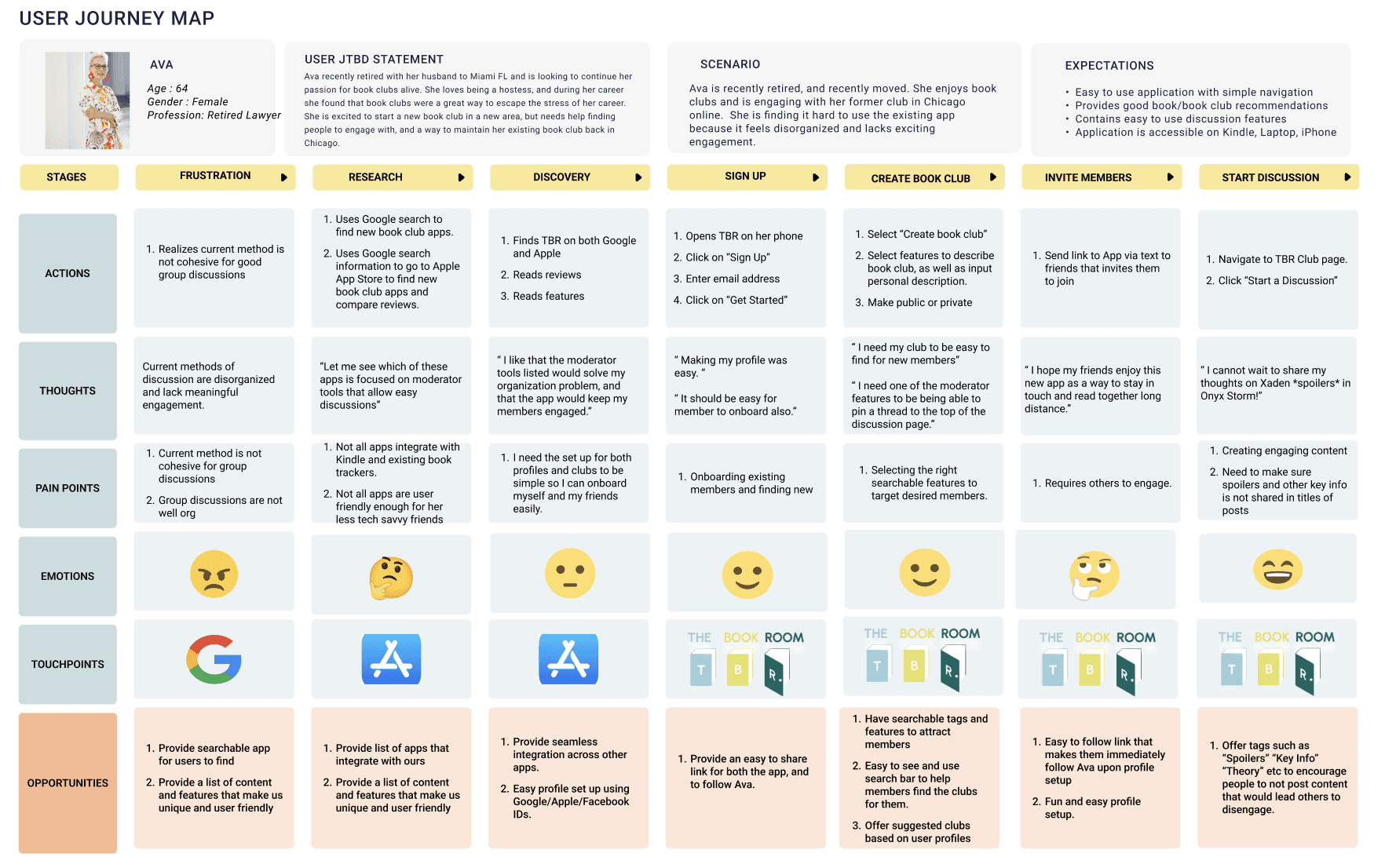
AVA
Mapping Ava’s Journey
Ava represents the user that is a book club moderator. She has the role of being a community leader and have personalized engagement. Designing a user flow for her required a careful consideration of ease of use and customization tools.
The goal was to create a journey where the book club moderator could set up a space, tailor the environment to match the specific reading group, and have a discussion page for the book club. The team had different ideas as to how this can be shown. So, we made our own separate task flows and then met as a group to discuss which parts of the flows that we individually made should be part of the final user flow. Below is a journey map that we created for Ava:
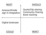
Building Features with Intention
Now that the user flow was established, the next step was to categorize prioritize features that we want the app to have. We used the MoSCoW method to do this. The team categorized features as either must haves, should have, could have, and won’t have. This allowed us to focus on the essential features we wanted to have based on the timeframe we had to build this app.
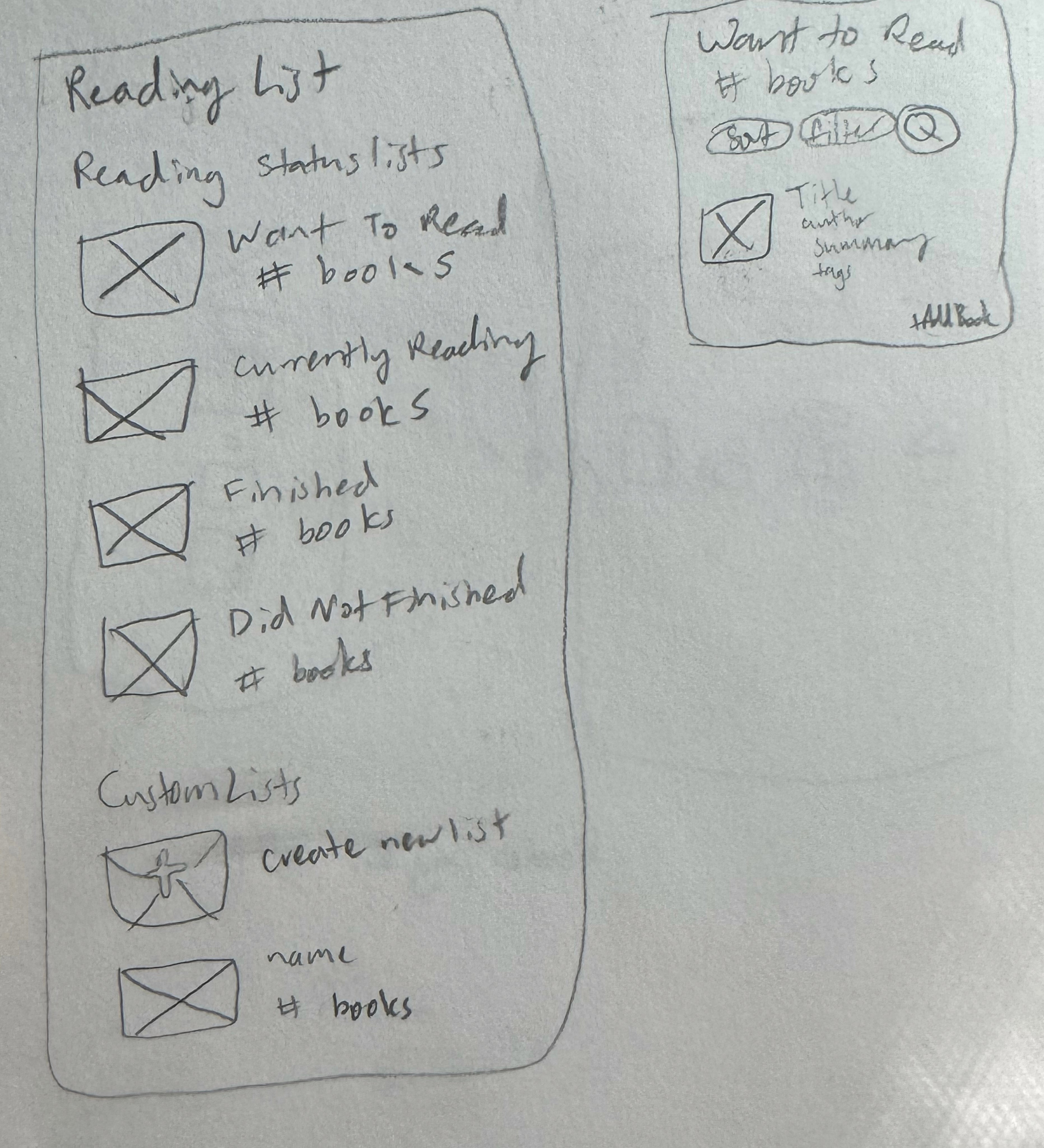
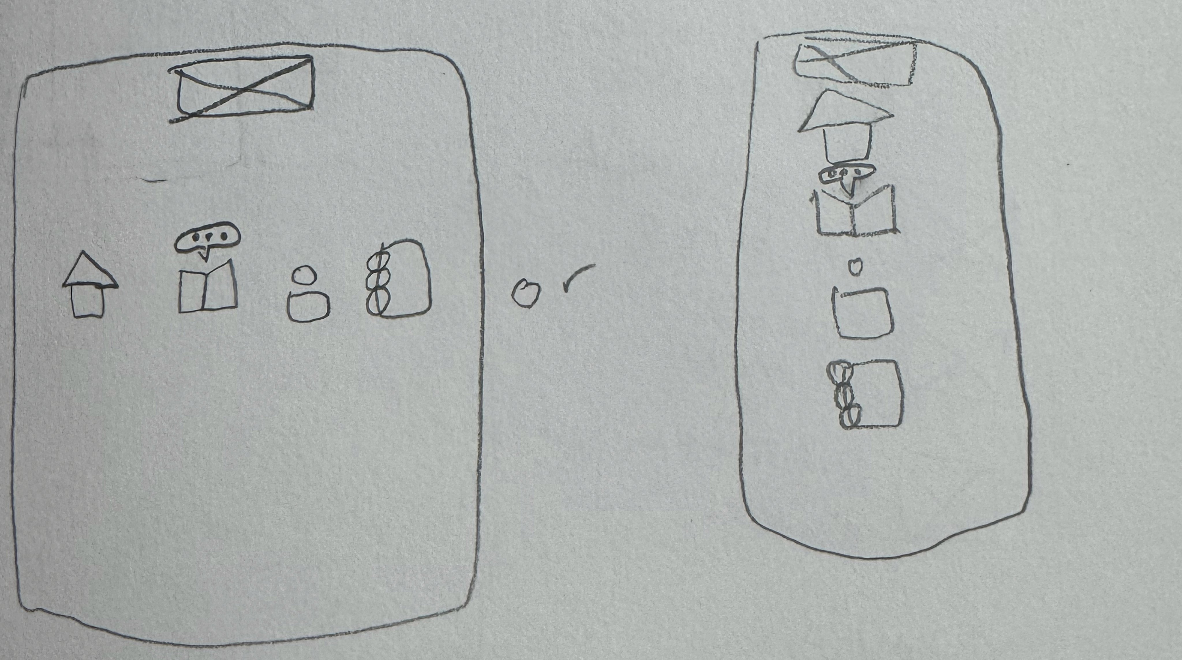
Sketching the Building Blocks of a Online Book Club
Following the MoSCoW analysis, we had features that we were going to prioritize. We moved on to the sketching phase to see how we can visualize them.
Above are the sketches of the book club pages, home page, and the reading lists that I made.
The Final Prototype
Following the MoSCoW analysis, we had features that we were going to prioritize. We moved on to the sketching phase to see how we can visualize them.
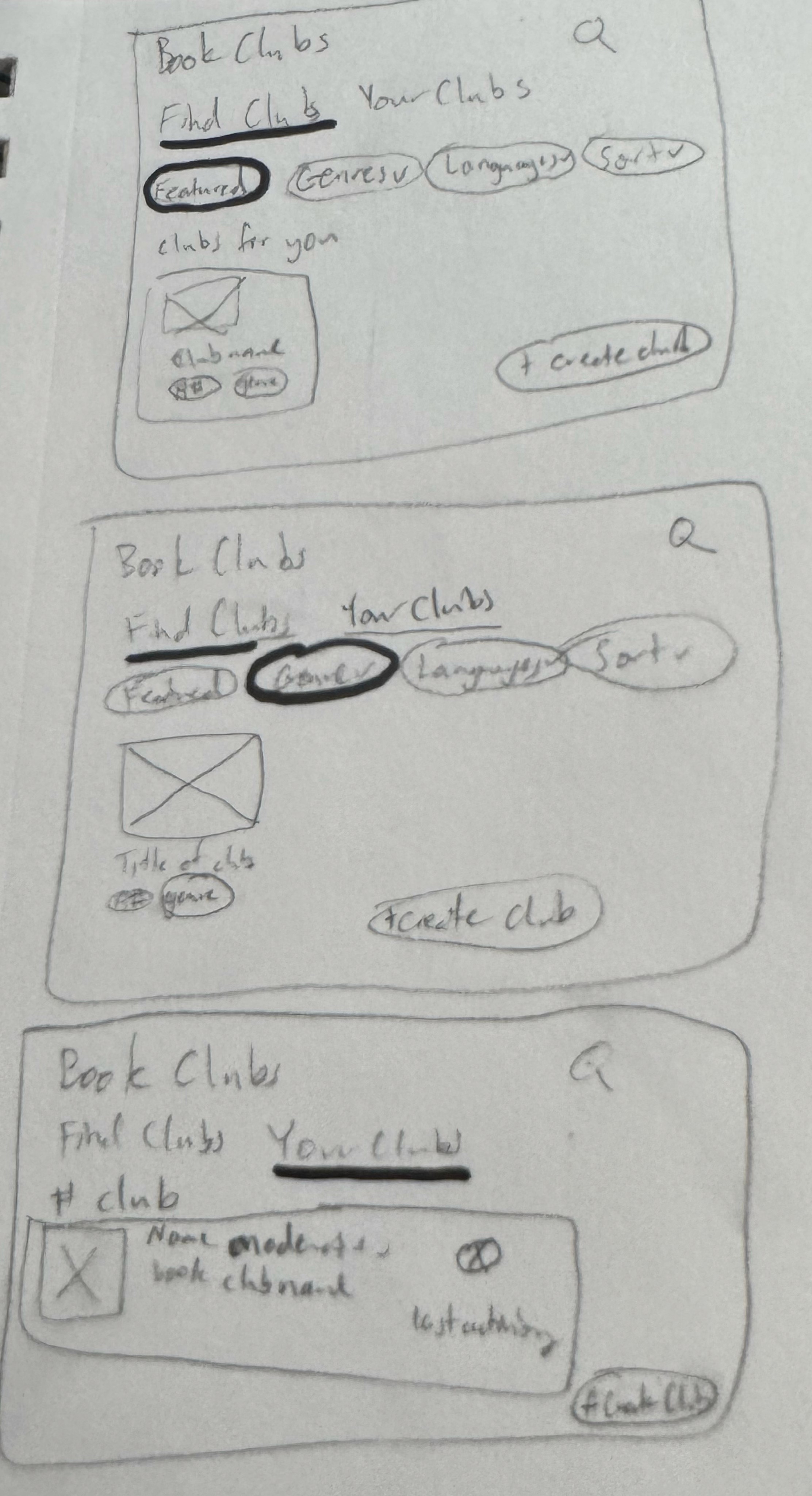
Once we were done sketching, we transitioned to the wire-framing phase to bring them to life. The sketches helped us in determining how we wanted the layouts to look. We put our sketches into digital wireframes to ensure a intuitive experience for book club moderators.
I made the wireframes of the personal library page and moderator setting pages which are above. I started out with the lo-fidelity before moving onto the hi-fidelity. Down below is hi-fidelity of the lo-fi wire frames:
Usability Test
We asked 4 users to do the usability test on the prototype that we made for our first iteration of the app. We had 2 tasks:
Go through the process of going through the moderator's setting page.
Go through the process of going through the discussion posts in Ava's Book Club.
For the usability test feedback, we asked those users if they encountered any issues while going through the prototype as well as giving us feedback as they go through the tasks. They said that the book doors are clever and cute. They also gave us feedback in what areas we could improve in, which we fixed.
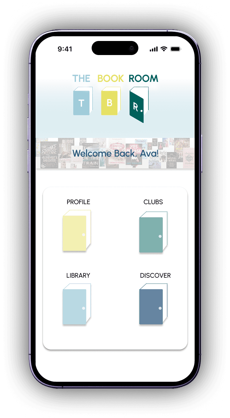
Prototype Walkthrough: Ava’s Experience (Book Club Moderator)
Finally, we have a functional prototype that allows book club moderators to build community, track books, and have discussions about the book.
Link to prototype is here.
Reflections
If there was more time, the second persona could have been more explored in addition to the primary persona.
Working within a design team was one of the rewarding parts of this project. Navigating different perspective in different stages of the project taught me how to communicate ideas clearly and how to give and receive feedback constructively.